

Introduction:
What is the dark mode?
The dark mode is a color scheme that uses light-colored text, icons, and graphical user interface elements on a dark background. This is an inversion of the default color scheme on iOS and other apps, which is generally black or dark text and icons on a white background.
Dark Mode was introduced in iOS 13 and announced at WWDC 2019. It adds a darker theme to iOS and allows you to do the same for your app. It’s a great addition for your users to experience your app in a darker design.
Benefits of using Dark Mode
Dark Mode is ideally suited to low-light environments, where it not only disturbs your surroundings with the light emitted by your phone but also helps in the prevention of strain caused to eyes. Whether you’re using Mail, Books or Safari, the text will appear white on a black background, making it easy to read in the dark. Using dark mode can often extend the battery life of your device as well, as less power is needed to light the screen. However, Apple doesn’t explicitly list this as an advantage.
Opt-out and disable Dark Mode
If you wish to opt-out your entire application:
- If you don’t have the time to add support for dark mode, you can simply disable it by adding the UIUserInterfaceStyle to your Info.plist and set it to Light.
| <key>UIUserInterfaceStyle</key> <string>Light</string> |
- You can set overrideUserInterfaceStyle against the app’s window variable. Based on how your project was created, this may be in the AppDelegate file or the SceneDelegate.
| if #available(iOS 13.0, *) { window?.overrideUserInterfaceStyle = .light } |
If you wish to opt-out your UIViewController on an individual basis:
| override func viewDidLoad() { super.viewDidLoad() // overrideUserInterfaceStyle is available with iOS 13 if #available(iOS 13.0, *) { // Always adopt a light interface style. overrideUserInterfaceStyle = .light } } |
Overriding Dark Mode per View Controller
- You can override the user interface style per view controller and set it to light or dark using the following code:
| class ViewController: UIViewController { override func viewDidLoad() { super.viewDidLoad() overrideUserInterfaceStyle = .dark } } |
Overriding Dark Mode per view:
- You can do the same for a single UIView instance:
| let view = UIView() view.overrideUserInterfaceStyle = .dark |
Overriding Dark Mode per window:
- Overriding the user interface style per window can be handy, if you want to disable Dark Mode programmatically:
| UIApplication.shared.windows.forEach { window in window.overrideUserInterfaceStyle = .dark } |
Please note that we’re making use of the windows array here as the key window property on the shared UIApplication is deprecated starting from iOS 13. It’s discouraged to use it because applications can now support multiple scenes that all have an attached window.
Enabling Dark Mode for testing:
If you start implementing a darker appearance in your app, it’s important to have a good way of testing.
Enabling Dark Mode in the Simulator:
Navigate to the Developer page in the Settings app on your simulator and turn on the switch for Dark Appearance:
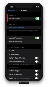
Enabling Dark Mode on the Simulator
Enabling Dark Mode on a device:
On a device, you can enable Dark Mode by navigating to the Display & Brightness page in the Settings app. However, it’s a lot easier during development to add an option to the Control Centre for easy switching between dark and light mode:
Switching Dark Mode from the debug menu:
While working in Xcode with the simulator open, you might want to use the Environment Override window instead. This allows you to quickly switch appearance during debugging:
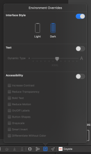
The Environment Overrides window allows changing the Interface Style
Enabling Dark Mode in storyboards:
While working on your views inside a Storyboard, it can be useful to set the appearance to dark inside the Storyboard. You can find this option next to the device selection towards the bottom:
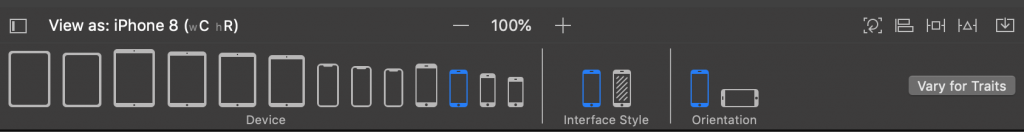
Updating the appearance of a Storyboard to dark
Adjusting colors for Dark Mode:
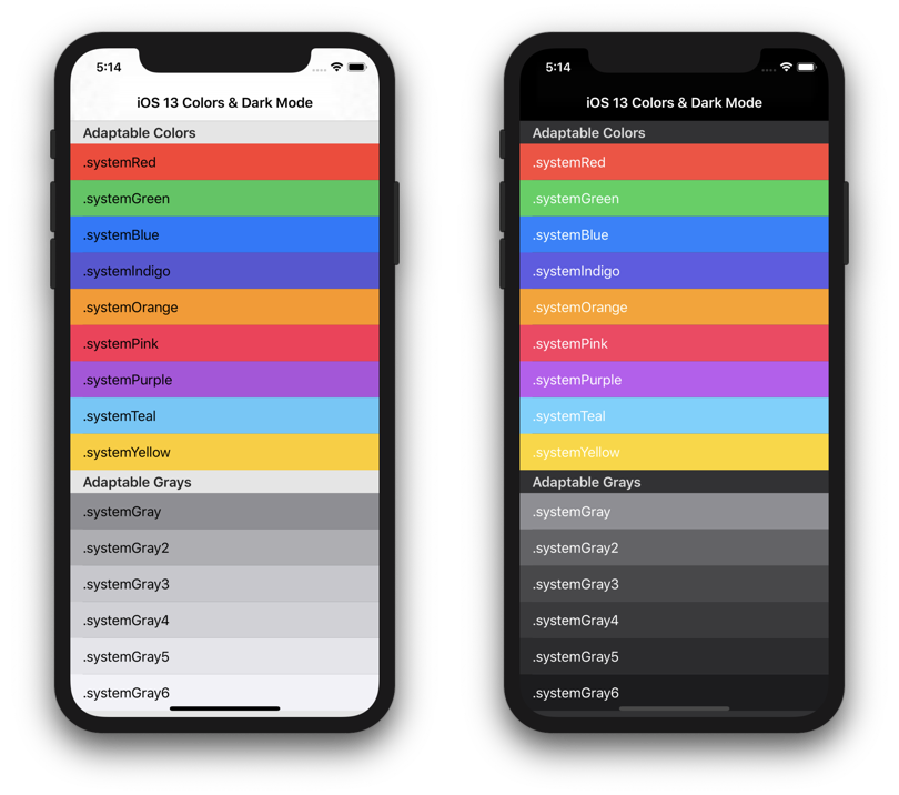
With Dark Mode on iOS 13, Apple also introduced adaptive and semantic colors. These colors adjust automatically based on several influences like being in a modal presentation or not.
Adaptive colors explained:
Adaptive colors automatically adapt to the current appearance. An adaptive color returns a different value for different interface styles and can also be influenced by presentation styles like a modal presentation style in a sheet.
Semantic colors explained:
Semantic colors describe their intentions and are adaptive as well. An example is the label semantic color which should be used for labels. Simple, isn’t it?
When you use them for their intended purpose, they will render correctly for the current appearance. The label example will automatically change the text color to black for light mode and white for dark.
It’s best to explore all available colors and make use of the ones you really need.
Exploring adaptive and semantic colors:
It will be a lot easier to adopt Dark Mode if you’re able to implement semantic and adaptive colors in your project. For this, I would highly recommend the SemanticUI app by Aaron Brethorst which allows you to see an overview of all available colors in both appearances.
The SemanticUI app by Aaron Brethorst helps in exploring Semantic and adaptable colors
Supporting iOS 12 and lower with semantic colors:
As soon as you start using semantic colors, you will realize that they only support iOS 13 and up. To solve this, we can create our own custom UIColor wrapper by making use of the UIColor.init(dynamicProvider: @escaping (UITraitCollection) -> UIColor) method. This allows you to return a different color for iOS 12 and lower.
| public enum DefaultStyle {public enum Colors {
public static let label: UIColor = { public let Style = DefaultStyle.self let label = UILabel() |
Another benefit of this approach is that you’ll be able to define your own custom style object. This allows theming but also makes your color usage throughout the app more consistent when forced to use this new style configuration.
Creation of a custom semantic color
A custom semantic color can be created by using the earlier explained UIColor.init(dynamicProvider: @escaping (UITraitCollection) -> UIColor) method.
Oftentimes, your app has its own identical tint color. It could be the case that this color works great in light mode but not well in dark mode. For that, you can return a different color based on the current interface style.
| public static var tint: UIColor = { if #available(iOS 13, *) { return UIColor { (UITraitCollection: UITraitCollection) -> UIColor in if UITraitCollection.userInterfaceStyle == .dark { /// Return the color for Dark Mode return Colors.osloGray } else { /// Return the color for Light Mode return Colors.dataRock } } } else { /// Return a fallback color for iOS 12 and lower. return Colors.dataRock } }() |
Updating assets and images for Dark Mode:
The easiest way to do this is by using an Image Asset Catalog. You can add an extra image per appearance.
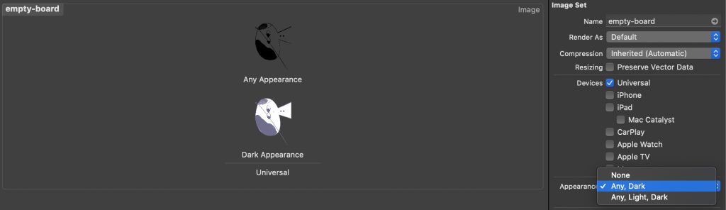
Adding an extra appearance to an image asset.
Conclusion:
Now, if you have finally decided to adopt iOS 13 dark mode, then here’s a simple checklist to follow:
- Download and Install Xcode 11.0 or latest
- Build and Run your app when dark mode is enabled
- Fix all the errors that you have found
- Add dark variants to all your properties
- Adapt Dark Mode one screen at a time:
- Start from the xib’s files
- Shift to storyboards
- Shift to code
- Repeat all the screens one by one
- Ensure to set the foreground key while drawing attributed text
- Swift all your appearance logic in the “Draw Time” functions
- Test your app in both modes, light and dark mode
- Don’t forget to change your LaunchScreen storyboard
By following the above process, you will be able to implement iOS 13 dark mode in your app with ease and confidence.