User experience is a combination of ease of use and the delight of use. In an application, a good balance between the two is required to say that it has a good user experience. With all the buzz in the industry with terms likes User Research, Persona, Information Architecture, Usability Testing, etc. being thrown around, it almost seems like rocket science.
So what can you do as a developer to improve the UX for your application?
Most of those books and tutorials available explain the concepts of human psychology which underpin the field along with some theories and tools around the steps of the UX process. These nudge your mindset to become user-centric. Understanding them and synthesizing the theories into designs take time and patience.
But don’t developers love hacks, cheat sheets, and shortcuts? Wouldn’t it be fun if someone translated concepts like reducing cognitive load into implementable steps?
So here are the top 3 simple hacks that can help you get started towards improving the user experience of any application.
1. Differentiate between Primary and Secondary Actions
Let’s start with understanding what are Primary and Secondary Actions.
On one hand, primary actions are often positive actions that the business wants the user to take to complete a task. In some cases, these can be negative actions like confirming the deletion of a file. Ideally, there should only be one or a maximum of two primary actions associated with a group of information or elements.
On the other hand, secondary actions allow users to do optional things or cancel primary actions. These could also be things the businesses don’t want their user to do, like delete an account. There could be any number of secondary actions.
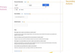
Good UI: Profile Screen from Flipkart
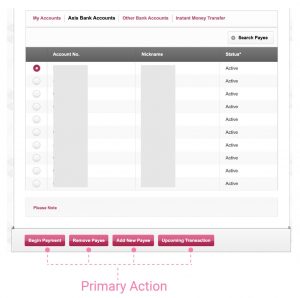
Bad UI: Payee list for fund transfer on Axis Bank
How?
Primary Actions:
- Limit the number of actions to one or at max two.
- Make them available upfront. Keep their location consistent across screens.
- Make this prominent – big, bold, saturated colors
Secondary Actions:
- Could be upfront or hidden under a pulldown menu.
- Less prominent than primary action – smaller, regular, light or neutral color
Why?
- To direct users towards task completion.
- To reduce both distraction and the probability of clicking the wrong button by mistake.
2. Sorting all lists
What do I mean when I say list? Product listings and data tables are lists. So are any drop-down lists, list boxes, options of checkboxes and radio buttons. They are also a collection of items.
How?
- Natural Sorting – Natural sorting refers to ordering the list by a parameter that does not require a context to understand. For example – Alphabetic order, ascending or, descending order.
- Contextual Sorting and Grouping – This method, on the other hand, takes into account the context in which the list is being present. For example – while selecting a bank for making an online payment, the most widely used banks are listed first.
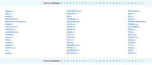
List of brands on Amazon sorted Alphabetically
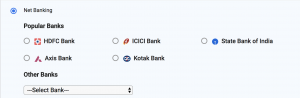
List of banks for making payment showing most popular banks first
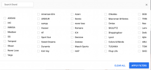
Unsorted list of brands – Flipkart
Why?
- Reduce the time taken to make a selection.
3. Useful error messages.
An error message is displayed to let users know that something went wrong. How do we know if an error message is useful or not?
Here is the checklist:
- Simple: It uses easy to understand language.
- Detailed: It tells what went wrong.
- Instructive: It helps the user understand how to recover from the error.
Let’s understand this checklist with an example which most of us are familiar with – Login Page.
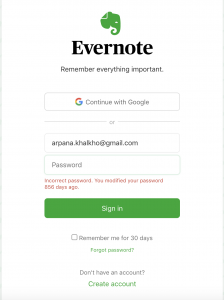
Good error message – Login page: Evernote
“Unable to authenticate user”
Simple •. Detailed • Instructive
“Something went wrong”
Simple •. Detailed • Instructive
“Could not verify username and password”
Simple •. Detailed • Instructive
“Incorrect username or password”
Simple •. Detailed • Instructive
Summary
You can start on the path of better user experiences by implementing the following:
- Distinguish between Primary and Secondary actions to reduce distractions and assist users to complete the task without confusion.
- Sort and group items logically to reduce the time for making a selection from a list.
- Use simple and direct messages which describe the problem and direct them towards the solution to help users recover from errors.